2013 Topps Archives #153 — David Ortiz

$(KGrHqVHJBUFHyHTkOkEBR8)Vfk84g~~60_57A great post today over at The Fleer Sticker Project on fans sitting on the billboard in center field during the 1967 World Series. Hard to believe one could pull of such a feat. Also hard to believe that the Red Sox are at home for Game 6, one win away from their third World Series title in ten years. I remember back in April thinking the Sox would be lucky to get to .500. I never would have thought they’d have a shot to make the playoffs, never mind the World Series.

In honor of tonight’s game, here’s David Ortiz’s card from this year’s Topps Archives set. It obviously is based on the 1990 design. I’ve always had an interesting relationship with 1990 Topps. I hated it, even when I was eight-years old when it was released. I thought the radical! neon color scheme was lame and an eyesore back then. Still, I bought a crap-load of the stuff; I must have hand collated the set two or three times over. Great shot of Ortiz here, looking as locked-in and cool under pressure as ever.

Hopefully he knocks a couple out of Fenway tonight and the Red Sox are able to wrap things up!

I’m back!

ImageCollecting has been non-existant the past four or five months. I moved from Boston to Brooklyn in late-August so any money that would have been spent on cards went into savings for the move. But now that I’m here and settled in and found a new job I’ll finally be able to get back into the swing of things and start posting again on a (semi) regular basis.

Tonight, the Red Sox return to the ALCS for the first time since 2008. Living in New York makes it extra exciting, especially since I teach at a college up in the Bronx and virtually all my students are Yankee fans. With all the postseason success the Red Sox had from 2003-2009 I started taking playoff baseball for granted. But after the nightmarish end to the 2011 season and the mess that was 2012, I’ve promised myself that I never will again.

The Williams card featured is obviously from the 2013 Allen and Ginter set. I really like how they chose to include more retired stars this year, like Williams, Nolan Ryan, and Hank Aaron. I bought a pack at Target while picking up a bunch of things for my new apartment so I’ll definitely start chipping away at this set soon.

1974-75 Lipton Soup #29 — Gregg Sheppard

74-75 Lipton - Sheppard 1That escalated quickly.

Twelve days after certain defeat the Bruins are back in the Conference Finals, for the second time in three years, to face the Pittsburgh Penguins. Gregg Sheppard, who would go on to play for both teams, came to the Bruins to help fill the void of Derek Sanderson and others taking off for the WHA. (Sanderson would be back, rather quickly, actually.) Sheppard played a large role in the Bruins’ run to the 1974 Stanley Cup Finals, netting eleven goals in the playoffs. He was traded to the Penguins a few years later, playing in Pittsburgh until retiring in 1982. I never saw Sheppard play but his size, stats, and knack for playoffs goals reminds me of Brad Marchand. Sheppard isn’t what interests me about this card, though, it’s the set itself. Lipton produced a 50-card set in 1974-75 on the back of their soup boxes. (If you have a couple of minutes be sure to read this great post on the set over at Diamond Cuts and Wax Stains.) The cards are a bit smaller than your traditional card and they had to be hand cut out of the boxes but they have a nice, simple design and are full of close cut, action shots like the one above, which look even nicer when compared to the plethora of ugly portrait shots O-Pee-Chee featured regularly back in the seventies.

But back to the Penguins.

I’m not sure if the Bruins have a chance this round. Pittsburgh has too much firepower, too many offensive weapons. They had a perfect month back in March, when they went 15-0-0, the first time ever in the history of the NHL.

Then again, I didn’t think they had a shot against Vancouver in 2011, or down three goals with 10:30 left against Toronto in Game 7.

74-75 Lipton - Sheppard 2

The Brief and Frightening Reign of the Cleveland Barons, Pt. 5

1977-78 OPC GirardI’m just going to go come out and say it: this card is a total mess. First, there’s a quality issue; it’s as if it’s a photo of a photo. And then there’s the strange, circular crop job at the top. I’ve spent hours pondering why it’s like this, trying to figure out a reason but I can’t. What makes it even stranger is that O-Pee-Chee used the exact same photo in his 1976-77 card without the black spot. So who knows. Also, there’s the usual airbrushing of his jersey. I particularly enjoy how the front trimming has been painted white but it remains yellow (from the old Seals jersey) on the inside by the nape of his neck. At least with Merrick’s they got the collar and shoulders right. Poor Bob. Even his smile is bad, reminiscent of a child’s third-grade school picture, taken right after gym class.

I’ve always wondered why some of the 77-78 cards used a all caps and a different font for the names on the back. Again, Merrick for reference.

1977-78 OPC Girard2

The Many Masks of Ed Staniowski

81-82 OPC Staniowski
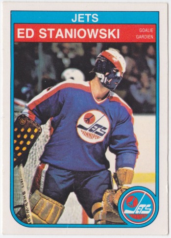
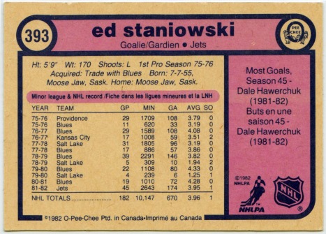
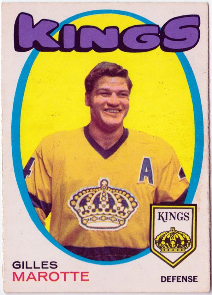
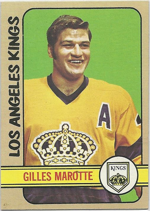
Trevor, from supportingtheminnow, recently sent me a box full of 1981-82 and 1982-83 O-Pee-Chee. By far my favorite of the lot is the Ed Staniowski on the left. There’s so many little things going on that I love: the angle, the old Jets logo, the brown leather pads, the red and sky blue border, the addition of the French “gardien” along with goalie, and, of course, the painted mask. Wow. Staniowski wore a number of terrifying masks throughout his career but this is one of my favorites. (It’s a shame you can’t see the other side because it’s fantastic.) This led me to do some research on Staniowski’s cards to see if he’s wearing his other masks. Unfortunately, he only has eight cards (well, six and a sticker and a team postcard) and of those, he’s only wearing a mask in four of them and none feature his other Jets masks or his famous Blues mask with two of the eighth note logos over his eyes. O-Pee-Chee loved the portrait shot back in the eighties, I’m not quiet sure why they didn’t have goalies wear their masks. Anyway, I’ve scanned and posted all of the masked cards below.
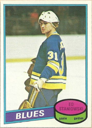
1979-80 O-Pee-Chee

Great photo, great design, great card, great set. I love the couple rooting him on behind the glass. I like to pretend they’re his parents. Somehow, his stance makes the mask scarier. He looks like a four-footed monster.
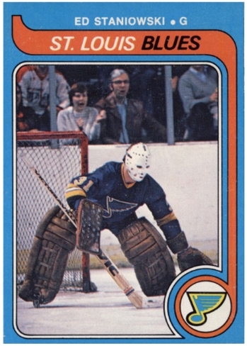
79-80 OPC Staniowski

1980-81 O-Pee-Chee

This one barely qualifies as mask isn’t really on. Love the angle of his stick and the glare. This would be Staniowski’s last card with the Blues before he was shipped off to the Jets. I really wish this card featured the logo mask I mentioned up. Interesting note: former Bruins Hannu Toivonen wore a tribute to it back in 2008.

80-81 OPC Staniowski

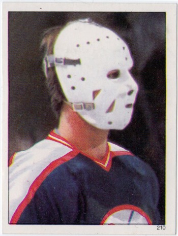
1981-82 O-Pee-Chee Stickers

Full on Jason Voorhees here. This is such a great photo and simple design I’ll forgive the airbrushed jersey. I have a bunch of stickers from this set and the photography is very good, better than the actual card set. I prefer to treat these stickers as cards and keep them loose instead of adhered to the album but their non-standard size makes them difficult to store. Any one have a binder solution to this?

81-82 OPC Staniowski sticker

Staniowski ended up playing a handful of games for the Whalers at the end of his career. Alas, there are no cards, or even photos online, that show his mask, though if a message board poster who claims to own a game worn mask of his is correct, he switched to a bird cage.

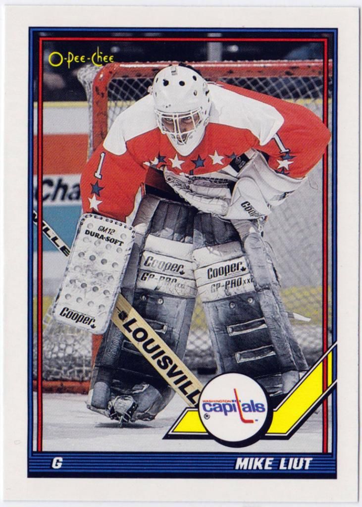
I like the idea of posting about masks through cards. I’m going to try and do this again–maybe with Mike Liut–in the near future.

81-82 OPC Staniowski 2

1971 Topps #530 — Carl Yastrzemski

71 Topps YazIt’s been months since I’ve done a baseball post so Opening Day seemed like the perfect opportunity. (I had originally planned a larger one on an oddball set from the seventies I found at a flea market this past fall but, as usual, time got in the way and it’s been delayed.) The Red Sox, who have been in a free fall on and off the field since August 2011, won down in the Bronx.

I’ve been neglecting the baseball sets I’ve been working on for a while for hockey and international stuff. Jeff from Cardboard Catastrophes and I traded some Loblaws/NHL Action stickers and 2009 Obak cards and he was kind enough to throw in this Yaz card from Topps’s iconic 1971 set. It’s not exactly NRMT but I love it and it looks great in my vintage Red Sox binder next to all the cards I inherited from my dad. If I had a bigger budget, this would be a set I’d love to start collecting. I love the modern, minimal design.

Everyone loves to place the underrated tag on players not named Mantle or Williams but I don’t think Yaz gets enough love. Looking at the back of the card, he was only halfway done with his career but still had 1,703 hits and 242 homers. He still had twelve years left in his career. He played until 1983 and had intended to play one final season in 1984 but tired in the last few months. He still holds the record for most games played for a single club.

It’s been years since I’ve gotten lost in a baseball season. As recently as 2007 I knew every player on every team and memorized starting rotations and batting orders. Last season, I probably watched twenty total regular season games, all involving the Red Sox unless you count the last three innings of Matt Cain’s perfect game. Hopefully, the Red Sox are able to recapture some of the magic from 2003, 2004, and 2007 and keep things interesting.

71 Topps Yaz2

The Brief and Frightening Reign of the Cleveland Barons, Pt. 4

77-78 Greg Smith1I’ve been working on this project, of scanning and posting each Cleveland Barons card from the 1977-78 O-Pee-Chee set, since about the start of this blog over a year ago. Aside from the single card or two, the 1977-78 set is the only one to feature players in a Barons sweater, so I thought it’d be an interesting idea to post all of them in one place. Unfortunately, I used up all the historical anecdotes about the franchise (and all my jokes about the city of Cleveland) in the first few posts so the project stalled. But I’m recommitting to it, so if you like, you can follow it by using the tag “Barons“.

Greg Smith was drafted by the Seals and moved to Cleveland along with the franchise in 1976. He played with the Barons for both their seasons. His rights were protected when the club merged with the North Stars and the extra players were dispersed in a draft. He stayed in Minnesota for three seasons and remained in the NHL until 1988, being one of the last remaining Barons (and Seals) to retire. Dennis Maruk is the answer to that trivia question–having lasted one more year. More on him another time.

77-78 Greg Smith2

Double Takes

A recent post over at Diamond Cuts and Wax Stains on Nick Beverley got me thinking about reusing photos/very similar shots for multiple sets, particularly back-to-back years by the same company. O-Pee-Chee seems to have done this on a fairly regular basis during their first run. I can think of a couple off the top of my head, outlined below, but I’m sure there are many others.

1971-72 and 1972-73 O-Pee-Chee Gilles Marotte

First up, a couple of early seventies cards of Gilles Marotte. I honestly can’t tell if they’re the same picture or just from the same photo shoot, I keep on going back and forth with the verdict in my mind. Marotte was a very good player that made a couple of all-star teams but he’ll probably be best known as part of the worst trades in NHL history being swapped in a package by the Bruins for Ken Hodge, Fred Stanfield, and some guy named Esposito. Two quick asides: 1. Marotte is a letterman jacket away from being one of Bif Tannen’s cronies, and, 2. Why the Kings don’t use this as their primary logo I’ll never know.

1976-77 and 1977-78 O-Pee-Chee Dan Maloney

I’m almost certain I’ve seen these two Maloney cards together before somewhere on the web but I can’t remember where. O-Pee-Chee also seems to be cribbing their own design here, just sliding the team name and logo to the bottom of the card. Also, what is it with the 1977-78 set that makes so many cards look airbrushed? That is, on top of the ones that actually are.

1990-91 and 1991-1992 O-Pee-Chee

Not the same photo, but as close as you can get. I wonder if these were both taken during the same game at the opposite ends of the ice. It’s like those what’s the difference? puzzles that were in Highlights magazine and every touch screen bar game where you need to circle the differences in two photos. (Speaking of Highlights, Upper Deck should totally do Goofus and Gallant cards that feature cheap shot artists like Matt Cooke and Lady Byng winners and put them as an SSP inserts set in O-Pee-Chee next year.)

1991-92 Bobby Orr BayBank

91-92 Baybank Orr1My friend gave me these a few years ago, before I got back into collecting and I filed them away in a box and kind of forgot about them until now. Back in the eighties and early-nineties Bobby Orr was the spokesperson for BayBank–a local chain of banks that merged with Bank of Boston to become BankBoston, which were then bought out by Fleet, which were then bought out by Bank of America. There’s three cards and an 8×10 and they were given away at bank locations and Bruins games. I only have the first two, in fact, I didn’t even know there was a third until I started doing research for this post. In a bit of irony, these cards feature BayBank’s blue and green colors which were also the colors of the Whalers who, if you grew up in central Massachusetts, competed for your loyalty. (I grew up closer to Hartford than Boston.) But I’m not going to turn this into another Hartford Whalers post. I promise. The juxtaposition of these black and gold photos from the seventies with the blue and green borders and BayBank’s logo that screams I’m-from-the-eighties is jarring.

The second card inverts everything. The colors are swapped, Orr’s name goes to the bottom and the company’s name shoots to the top. I think I like this one better though, I like the angle up against the boards, how little tape is on his stick.

Not surprisingly,  BayBank chose to omit Orr’s stats from the two seasons he played in Chicago on the back. I like the simplicity of the backs and how they (mostly) show his career stats. The third card in the set is the best but I don’t have it: Orr is digging the puck out along the boards with Bobby Clarke and his mop right behind. In 1995, BabyBank produced another card, both a standard and oversized version.

91-92 Baybank Orr1 back

1976 Scanlens VFL #120 — Graham Melrose

1976 Scanlens VFL MelroseInternational cards continue to fascinate me. I’ve won a few auctions on ebay and plan to post about various cards and sets as they trickle in from around the world.

The Australian card company Scanlens–which I wrote about a couple posts ago–produced cricket, VFL, rugby, and non-sports cards back in the sixties and seventies. As I also mentioned, most of these featured designs they licensed from Topps. However, some, such as the 1976 set to the right, seem to have an original look. Graham plays for the North Melbourne Kangaroos, one of the oldest teams in the then VFL, now AFL. (After the league expanded out of Victoria in the early-nineties, they changed the name to the Australian Football League. Great team name, great colors.) Although an uninspired (to say the least) photo I do appreciate the backdrop and the old Adidas soccer cleats. And, if I’m not mistaken, this is Melrose’s rookie card. Nevertheless, he helped the Kangaroos reach the Grand Final in 1975 where they lost to Hawthorn.

I don’t know much else about Australian Rules Football. When I was growing up, NESN used to show Australian Rules Football games during the morning after SportsDesk, their version of SportsCenter. I remember having no clue how the game was played and laughing at their umpires (refs?) because they alway wore white sport coats and white fedoras but I can’t find any evidence on the internet so maybe I’m making this up? A false memory?

Oh yeah, and the back of the card is blank.

1976 Scanlens VFL Melrose2