Puzzle Pieces

I never really liked Donruss. When I started buying baseball cards in the early nineties they had such terrible designs. And I hated getting puzzle cards. I’ve come around on the puzzles though. I have the Yaz one put together in my apartment. But the puzzle cards are almost better alone. They either look deconstructionist, or like a comic book panel.

First Yard Sale Find of 2012

Because of eBay and other online resources, the number of deals at flea market and yard sales are dwindling. Most sellers are computer-savvy enough to look up cards on eBay, however, they often mistake  listing prices for actual sale prices. This is further complicated by the fact that items will sell at much higher prices on eBay where a listing can easily reach thousand of potential customers. At a flea market, the number of potential customers can be measured in dozens, if that.

Enough micro-economics.

I found a stack of cards in top loaders at a yard sale down the street last weekend. Most were 1972 Xograph All-Time Greats but at the bottom, in a screw down case was this.

There’s a ding on top above the ‘T” and it’s a little sun-faded but the corners are sharp and its well centered. Everyone’s familiar with Pudge but Cecil Cooper had a number of great years with the Sox and later, the Brewers. Garman was rather unspectacular.

Image

Opening Day

I haven’t made a baseball post in a while so, in honor of Opening Day, I thought I’d post some of my favorite Red Sox cards from my early days of collecting. (The Sox lost out in Detroit to the Tigers in extra innings today. I don’t have very high expectations for the team this season.)

I’ve chosen a card from each Topps set (minus the 1990 one, it’s too ugly) from when I started buying cards until 1993. The late-eighties teams enjoyed a few great seasons under Joe Morgan; they advanced to the ALCS in both 1988 and 1990, only to get swept by the A’s.

The card on the left is from the ’88 Topps set. I love the white vignetting and scripted font. The Red Sox now wear away uniforms like Wade and Spike have on here, but they’ve ditched the navy undershirts for red, which throws the whole thing off.

But first, one of my favorite baseball sets.

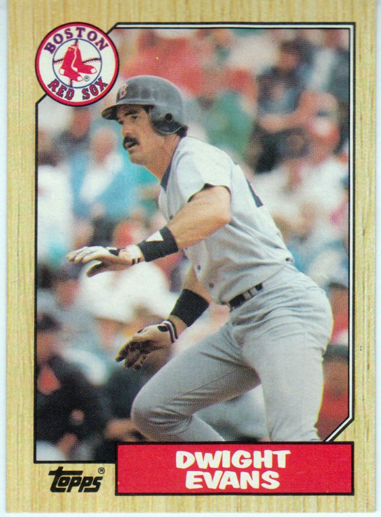
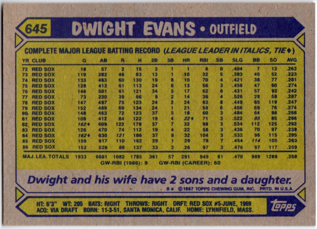
1987 Topps #645 — Dwight Evans

This was the first set of cards I ever collected. My dad used to bring them home for me after work. I remember getting upset whenever I didn’t get any Red Sox players in a pack. I think Marty Barrett was the first Red Sox card but I’m not sure. I love, love, LOVE the woodgrain frame. (More soon, from a hockey set.) I really should own this set, considering its sentiment and design.

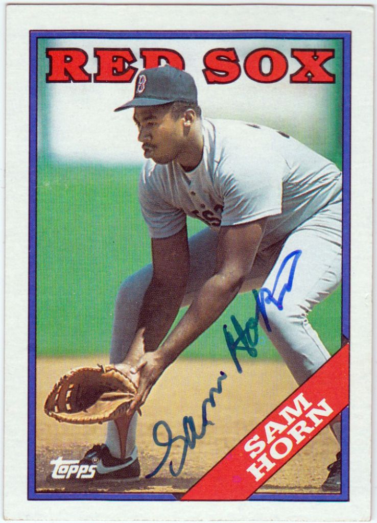
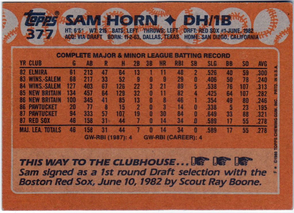
1988 Topps #377 — Sam Horn

This is one of my favorite cards. For those of you unfamiliar, Sam Horn is something of a folk hero in New England for his prodigious power and being Bill Buckner’s replacement after the 1986 season. Back when I (briefly) collected autographs I sent this away to his home residence. I was pleased when it came back within the week signed. However, I soon realized that Horn wasn’t in Texas at all from when I dropped the card in the mail until it returned; he was in Boston co-hosting the post-game show on NESN. A quick confirmation with a certified autograph on ebay confirmed it to be a forgery, most likely by a relative. Somehow, this makes me like the card more.

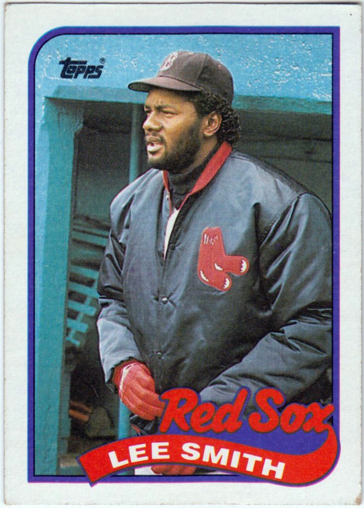
1989 Topps #760 — Lee Smith

At some point, I collected a story of Lee Smith, after going a couple of years without an appearance, falling asleep in the bullpen at the All-Star Game with two Big Mac wrappers at his side, but I can’t find any evidence to support it on the internet

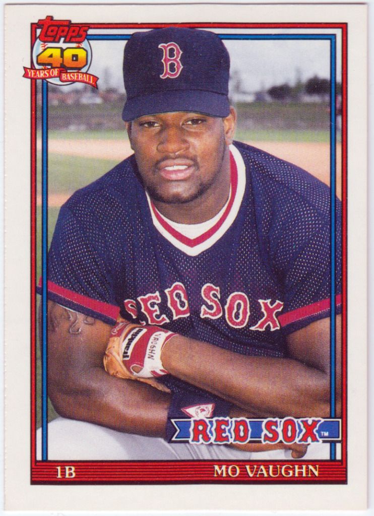
1991 Topps Traded #123T — Mo Vaughn

After the loss of Nick Esasky, Mo Vaughn became my favorite player, even before he made the big league club. My dad would take my brother and I to Pawtucket to see the Paw Sox when Mo was on the team. Everyone would chant “Mo! Mo! Mo!” every at bat, even if it was the bottom of the first. I still get sad when I think of him leaving for Anaheim.

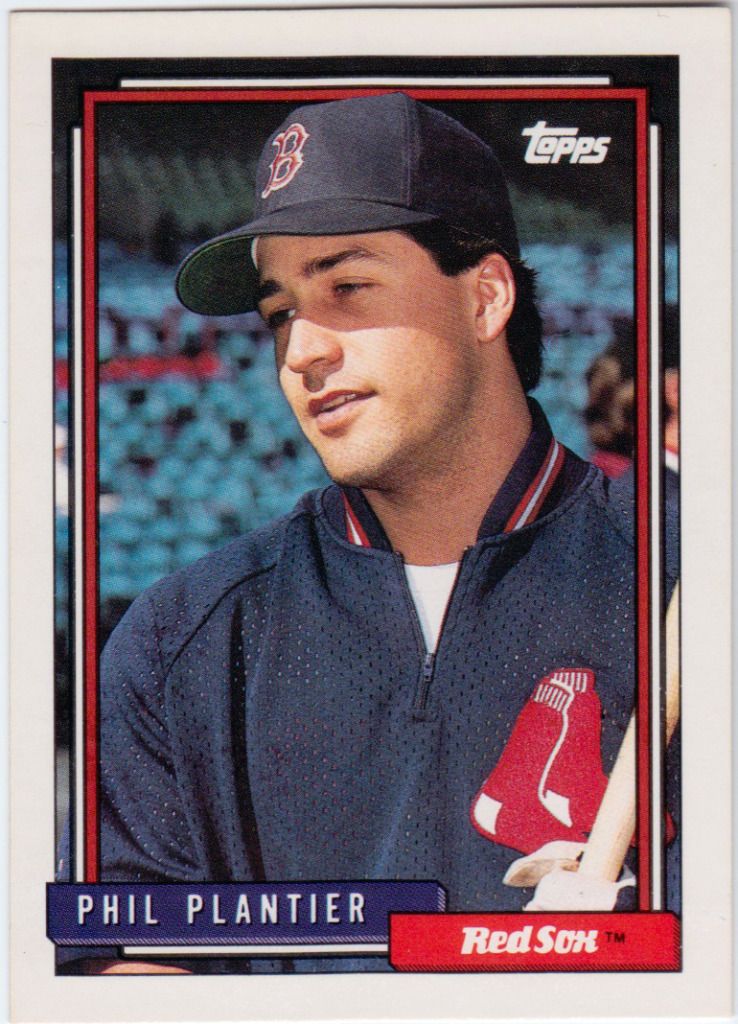
1992 Topps #782 — Phil Plantier

Plantier had some pop and a ridiculous batting stance. I remember watching his major league debut in Maine. The Red Sox were in Toronto and he didn’t have a proper batting helmet, so he used his Paw Sox one with the ‘P’ painted over.

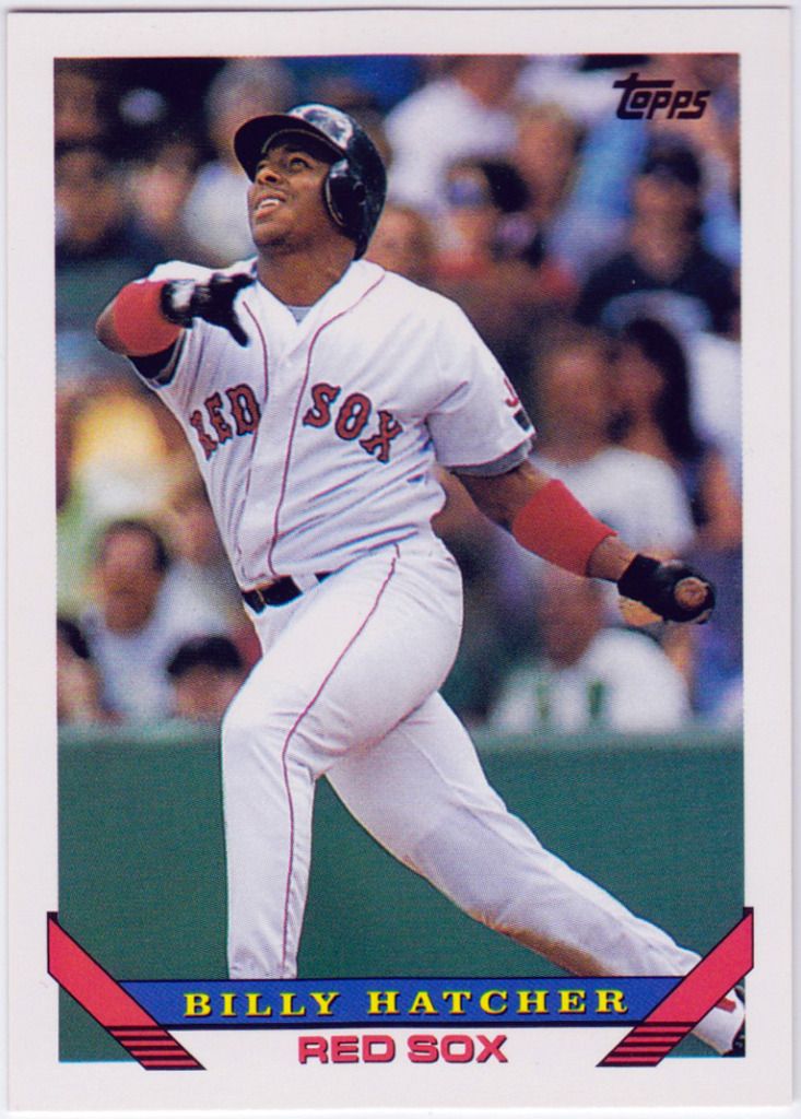
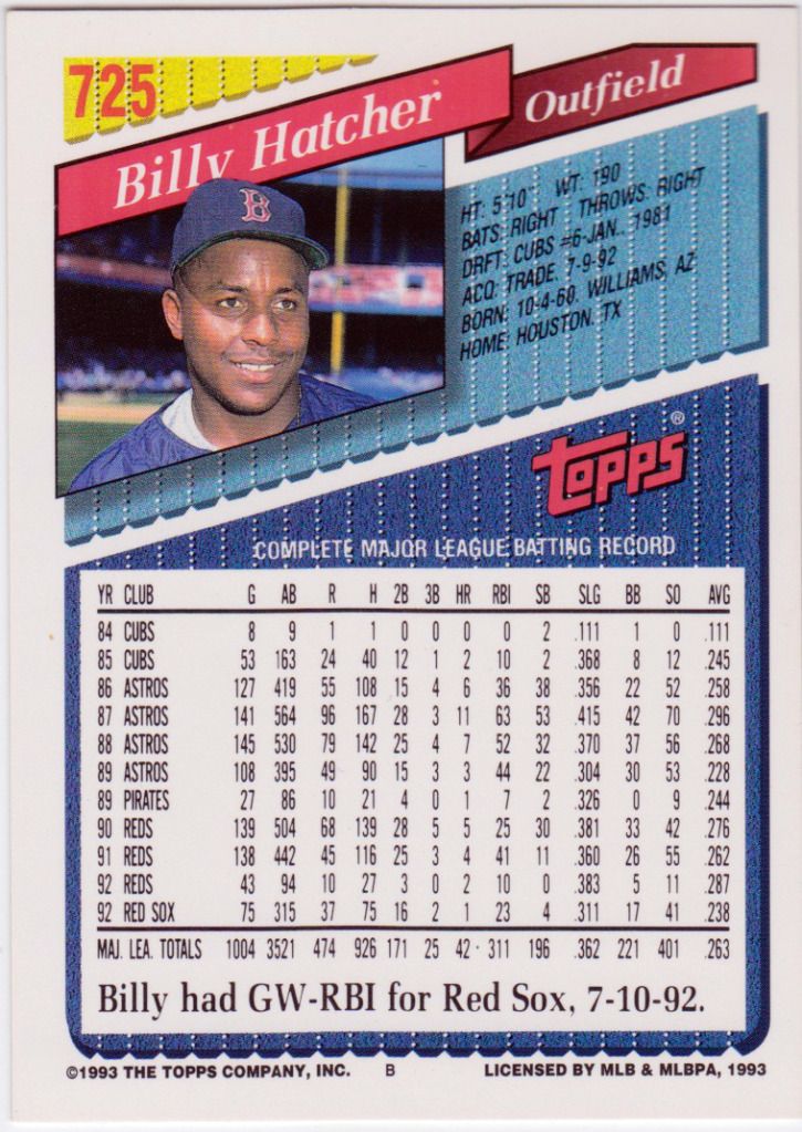
1993 Topps #725 — Billy Hatcher

This was the last Topps flagship set that featured a design I enjoyed. It was also the last without a glossy finish. My brother and I were obsessed with Hatcher after he stole home. I remember thinking how impossible and improbable it was. How could it be legal? Why don’t they do it all the time?

Kimball Champions

Image

Great mustache.

Topps reproduced these 1887 tobacco cards as a mini insert set in their 2011 flagship set. There’s a 150 in all, 50 from Series 1, 50 from Series 2, and 50 from Updates and Highlights or whatever they’re calling Traded sets now. They’re a little taller than your average Allen and Ginter mini, just enough so they poke out of the 20 count pages.

Most of the cards feature great throwback uniforms, particularly The Hawk in the old Expos spring training uniforms AND baby blue away on the left. Others include Dave Winfield in a Padres yellow and brown Burger King jersey, Mike Schmidt in Phillies maroon pinstripes, Reggie Jackson in a yellow A’s vest, and Paul Molitor in those Blue Jays uniforms with the eighties numbering that they just brought back.

I love the two picture design and Champion Base Ball batter/pitcher description on the cards.

I remember Dawson coming to the Red Sox when I was a kid. He hit his 400th home run at Fenway in April, then got injured a few games later. He was largely innefective in his two years here, during the dark days of the Butch Hobson Era. After the strike ended in 1995, he signed with the Marlins and played two more years before retiring.

I miss the Expos.

February Inventory

Added another 16 cards to my 2009-10 Champ’s set via a trade with Justin from The Hopeful Chase. One of the rules I’ve set for myself is to work on no more than four sets at a time. I’m defining “working on a set” as a set that’s less than 85% completed. So we have:

  • 2011 Allen and Ginter, 718/996, 72%
  • 2009-10 Champ’s Hockey, 310/580, 53%
  • 2008-09 Champ’s Hockey, 38/680, 5%

I’m looking to add another set, something older or vintage, if you include the mid to late eighties in the definition of the latter. Any suggestions?

Two Bobs


1989 Topps #29T — Nick Esasky

Great year, great beard.

The first year I really got into sports was 1989. I was six. The Red Sox had a mediocre season, sandwiched between two AL East division titles, going 83-79. The lone bright spot was their first basemen, Nick Esasky. Acquired from Cincinnati in the off-season, he hit 30 home runs and added 108 RBIs. Esasky was my first favorite player. Every morning, I’d ask my dad if the Sox had won the night prior. And, seemingly, every morning, he’d say they had, and that Esasky hit a three-run homer.

Topps were my favorite cards growing up, and the 1989 set remains one of my favorites in terms of design. I love the scripted team names–they remind me of old Little League jerseys–the asymmetrical rounded corners, and white borders. Esasky only appears in a Red Sox uniform on two Topps cards; this from the ’89 Traded set and another from the hideous 1990 series. 1990 Topps is one of my least favorite baseball designs of all-time; only the yellow legal pad layout of 1991 Fleer out does it. (Special mention to the red menace that is 1990 Donruss, with their Pollock-esque splatter design in the left and right margins.)

Esasky left Boston after a single season, signing with the Braves. The rest of his story is an awfully sad one; he only played a handful of games in 1990 before being forced to retire after developing vertigo stemming from a bad ear infection.

I love how vibrant the colors are on the back of late-80s Topps Traded.

2011 Allen and Ginter

Dream of the 1890’s

This is another set I’m working on; all the base cards, minis, and inserts. They’re fairly rare, I think at only 1-2 a case. Most prices are silly on eBay (especially Brian Wilson’s) but I was able to get this for a decent amount.

Even though I teach English as a Second Language, I admit that I had to look up “flocculence” in the dictionary. It’s the noun form of flocculent, which means “having a fluffy or woolly appearance.” Unlike the previously mentioned Champ’s Rookies, these inserts really nails the aesthetic and matter of the  early 20th century. Ditto the rest of the inserts, though Topps made a few decisions with their base set I’d say are strange at the very least.

A connection between an obsession with strange facial hair that existed in the 1890’s and its current renaissance was parodied in the latest episode of Portlandia in which Fred Armisen sports a bib.

Usually, Allen and Ginter inserts have terrific backs that are cleverly written, so I was disappointed to flip this one over and find only a checklist.